
Celebrating the Visuals of Metal of 2023 with Metalligator

We love art here at The Goat Review. There are a few musicians in the crew and I myself work with comics, illustrations, and album covers. Our discussions of music and art will often cross over from pure appreciation or interest to the technical side of things. When you know a little about how the sausage is made, the things you appreciate can differ from the usual perspective. Whenever I look at album art, my appreciation tends to be directed towards well constructed images, the composition as a whole. And this is a perspective that I have found to be odd when previously discussing album art with other metal fans. In writing a list of my favorite album art last year, the feedback I received was positive, stating that the people had enjoyed peeking behind the curtain of how I see the images and how they are constructed. To improve on it this year I used the same approach, but with added diagrams of the covers in an attempt to point out visually what might be lost in translation with the text. This list is about my appreciation as a fan, lifting up the visual artists primarily. There have been plenty of album covers that are great this year, as any year. This list is not made with the pretense of being “better” than a layman’s picks of favorites, rather I just hope you find it informative and a help in thinking about art in general. Enjoy!
Please swipe or click right on each image to get the full breakdown
Jeanne Comateuse
for Nightmarer – Deformity Adrift
magma-sound.com | facebook.com/magma.art.and.sound | album review
The cover for Nightmarer‘s new album Deformity Adrift stuck out to me because of how unusual it is for a genre like death metal. Sure, there is the horribly contorted figure front and center grounding it in the genre, but the warm color reflects one of the characteristics of the album that makes it too stand out: a warm sounding production that changes the impression of its violent dissonance and cutting palm mute strikes. The small circle of the sun draws both the viewer’s attention as well as the deformed figure’s gaze. Centered around this spot, the warm colors make sure you stay there to observe the light of the scene. Artists often struggle to get this right—to keep your attention. The circle motif tends to produce a calm mood, contrasting in a surprising way against the music contained. The piece could originally be a painting because of the strokes visible in fine detail, but I also found that Comateuse‘s available media reveals experience in airbrushing. Whatever technique, this is a unique and wonderfully contemplative piece from a painter/audio engineer that should not go unnoticed. Make sure to check out the full landscape of the composition.
Cameron Hinojosa
for Krigsgrav – Fires in the Fall
cameronhinojosa.com | instagram.com/camohimself | album review
Let’s go over that bit about circles again because the cover for Fires in the Fall contains two! Krigsgrav have made an album about the changing seasons, honing in on traditions and man’s connection to nature. The concept for the art comes from the band themselves according to the credits, but I can only speculate on who made what choice in the production of the cover art. A blowing wind shifts the cape of the hooded figure and the top of the trees, bringing movement to the piece. Yet what this art communicates to me is a stillness, even in the face of the elements—a reverence for nature, in all its volatile glory. The oval of the highly unnatural clouds with the logo in center pulls us down towards the hooded figure’s gaze and further down to the half circle produced by the rocks and fires, forming an implied ellipse on the ground. This represents the music well with its crawling pace, surrounded by gale-like tremolos. Hinojosa has set the colors to reflect the muted autumn palette that gets stronger in saturation around the ground. Meanwhile, the trees are mostly silhouettes apart from the branches, creating perspective depth while staying out of the way of the rest of the image’s geometric pull and clarity.
Lydia Burris
for Bekor Qilish – The Flesh of a New God
lydiaburris.com | instagram.com/madartistlydia | album review
Bekor Qilish fits the standard I, Voidhanger mold—to throw experimentation at the wall and see what sticks—and have managed to produce a good sophomore album in The Flesh of a New God. Burris‘ cover art follows suit, looking like a mixed-media freak out in the best of ways. This image immediately conveys “weird”, mixing Burris‘ pencils, painting, and printed paper cutout in a way that reminds me of art one might find in Dave Mckean‘s work on the Sandman graphic novels. The hair-like braid filled with eyes has a strong downwards pull into the halo-like orange crescent , an effect amplified by the strong dash of color on the skull’s forehead. The darker spots around the figure makes it jump out and combined with the strands flowing out from the skull it makes it look like it has burst out of some kind of cocoon. This piece poses a ton of questions, fitting for a similar arrangement of music that likes to keep you on your toes. Making an image pop with these kind of muted colors takes some considerable skill.
Natasha Nor Azmi
for Iravu – A Fate Worse Than Home
instagram.com/rakodama
Watercolor is woefully under-utilized in metal album covers. That’s why it makes me happy whenever I see a cover as well done as the one gracing the front of A Fate Worse Than Home. Nor Azmi brings the same kind of dreaminess to her work that can be felt in Iravu‘s music. Making an image of space seem interesting is a hard task yet this equally grotesque and calm image manages this with a big dash of color that plays on color blending, one of watercolor’s strengths. The two strong colors in the middle make for a cushion that allows the diagonal of the floating body to keep hold of attention, while the logo and album name help to keep a tidy frame. Also the subtle lighting captivates—one strong light coming from behind the body and a softer light coming from the right-hand side. As far as I can tell, Nor Azmi has used regular watercolors with the addition of some pencils, possibly watercolor pencils, to capture this simple subject—nothing simple about its production.
Mow Skowz


for The Turin Horse – Unsavory Impurities
instagram.com/mmowskwozz (NSFW)
Looking through Mow Skowz‘s gallery on Facebook or Instagram, you will find a cacophony of NSFW BDSM photography, twisted instruction-manual art (love these!), and fantastic acrylic paintings. When looking at this piece, I still cannot parse if this is a photograph that has been painted over as the anatomy of the piece is unbelievably tight. Even if that is not the case, I can imagine that heavy photo reference involved shaped the body, with the rendered texture on the figure’s skin coming across particularly well. Perhaps surprisingly, the flat background is one of the image’s strengths: a simple shadow is enough to create some depth while pulling your attention to the figure’s face with the absolute contrast that black tends to provide against brighter colors. This is an image that shows off the inner chaos of the human mind well. As such, it’s a no-brainer that The Turin Horse chose to go for this particular piece (likely licensed as Skowz‘s Facebook portfolio indicates a 2014 creation date) as it represents perfectly the unhinged fusion of punk and noise Unsavory Impurities throws down.
Mothmeister
for Wolvennest – The Dark Path to the Light
instagram.com/mothmeister | etsy.com/shop/mothmeister
A lot of people don’t know how much work goes into photography. Metal as a genre has tended to favor traditionally painted works, not that I am against that, but a powerful photograph can rival a painted piece if done with an artistic mindset. Enter Mothmeister, a Belgian photography duo that are also collectors of taxidermy and death masks. While they don’t make any of these props themselves, they regularly work with people who sculpt figures and they have an appreciation for the morbid, seeking out taxidermy that isn’t completely perfect as to preserve the grotesque beauty. On this work for The Dark Path to the Light, this duo has composed the set using three strong vertical lines. They are uneven, making the picture ooze unease. The two statues protrude a hard strength that translates to the figure in the middle, the main subject. Next, the colors make the main figure stand out as white and black regularly tends to trump everything else. The reddish glow on the statues make them step back in the composition, amplifying the importance of the figure in white. The rest of the image is black, leaving you to only contemplate the relation between the three pillars. But, ultimately, It is a striking image that needs no further explanation to admire.
Daemorph Art
for 7H. Target – Yantra Creating
instagram.com/daemorph | album review
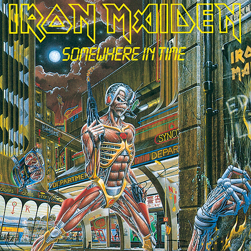
When discussing the contenders for this list with my site colleagues, I left them confused as to why I like this album cover. As always, one part is down to the composition of the piece, but the other is down to nostalgia. The impression that Daemorph has managed to create on Yantra Creating‘s front reminds me strongly of the kind of artwork that graces the middle period of Iron Maiden. Namely, it gives me the same kick I got in seeing the art for Somewhere in Time for the first time. But there is more to this picture than that. In fact, this image should really not work for how complicated it is. I can spot three separate triangles in it, and Daemorph has enough intuition and skill to make that kind of dense platform work. There is the central figure and bodies making up one triangle, the feet of the central figure making up a second, and the huge statue in the background making a third one. What ties them together is color. The curved line of the water pushes you back into the middle and in a similar way, the circle of clouds up top calms things down while the eye beams from the statue end in another circle of distorted colors. Chaotic shapes, yet everything is clearly readable. And how can I resist a slam album placing a cybernetic crotch near the center-point of the image? Fantastic.
Alex Eckman-Lawn
for Somnuri – Desiderium
instagram.com/Alexeckmanlawn
Desiderium made my list of favorite albums this year because of how well Somnuri mixed grunge and sludge, something I didn’t think was possible. But my interest in the album started with Eckman-Lawn‘s excellent artwork, work which uses stylized photo manipulations and layers of printed paper cutouts to create a textured look with depth and real-world lighting. His style is fantastic and has graced more covers than this in 2023 (Afterbirth‘s new album comes to mind), yet there is something that draws me to this particular piece that is hard to explain. Perhaps it’s as simple as feeling, the image captures the downtrodden feel of the album very well after all. From the double vision effect of the mourning faces in the center to the liquid patterns around, what ties it all together is the use of color. The lines making up a square and circle display in an attempt at keeping it contained in the middle, but what actually pulls it off is the bright teal halo of the figure with its counterweight of the burning orange eye underneath. There’s a strong dynamic pulling you to the middle that echoes the mix of styles present in the music itself.
Andrew Tremblay
for SARMAT – Determined to Strike
instagram.com/actremblayart | album review
From illustration and comics to street art, Tremblay is an artist I appreciated even before I knew his name, because of his work with Imperial Triumphant. Working in both physical media and digital art, his work is impressive and so too is true of this work for Determined to Strike. A cyberpunk style that remains organic, this cover reminds me of the style that graces the covers of Voivod albums. First, the color of the explosions and light coming from the fire keep things coherent in the middle while making the background elements muted. But what I like the most about this piece is its strong downward direction. You can really feel the step of the soldier in front because of the whole piece feeling like an arrow pointing downward at the broken ground. There is a sense of movement here that is central to producing great comic art. It’s visible in the placement of color, the geometric shapes and in the rendering lines themselves.
Santiago Caruso
for Deitus – Irreversible
santiagocaruso.com.ar | instagram.com/santiagocaruso.art | album review
This is the only cover on the list that I can commend for breaking the rules. The way the figures trapped in the ground are moving out of the image creates a momentum so strong that it tells you a story just by the fact of how uneasy it feels to watch. But I cannot overlook how well Caruso selected this muted color palette that focuses in on the figures themselves. Different placement could have made the whole image confused. A good way of understanding this is looking at the topmost figure’s hand that is breaking the horizon. The area around the hand is very near black, as to direct you away from that part of the image background to the downward slope of the sinking figures. The strong pull and oppressive feel of the piece is a tight fit to this tense black metal album. Normally these kinds of techniques don’t make much of an impact, but the cover for Irreversible made a strong impression on me that has lasted for months. Masterfully done!
Paolo Girardi
for Lurk – Aegis
instagram.com/paologirardipainter
Girardi needs no introduction in the conversation of metal art, and his style is a great fit for the trudging death doom of Finnish band Lurk. Lately, Girardi‘s work has tended towards a muted color palette, a trend that he breaks here with more contrast and highlights than usual. But what sets this piece apart is how complicated it is while remaining discernable. With the band’s logo balancing the building/creature on the left side, a sense of momentum develops that splits the image into three parts, adhering loosely to the rule of thirds. Mainly, I am impressed by how the middle third is taken up by the circling monster-dragon. It carries my eye through the middle in a spiral and straight down. A beautiful highlight then emerges like fire out of the dragon’s mouth. It’s an odd idea that nevertheless works and absolutely packs in detail in smaller spaces without making you lose the plot. This is one of the best paintings I have seen from Girardi for some time where all of its details gets to shine.
Adam Burke
for Wormhole – Almost Human
nightjarillustration.bigcartel.com | instagram.com/nightjarillustration
For all the fantasy vistas, castles, and vast space paintings that Burke makes, I think it’s his more intimate pieces that show what a talented artist he really is. As is with his Unto Others cover art, so is true with his new piece for Wormhole. The large, humanoid figure takes up most of the space against a fairly simple background, yet the total image itself is packed with points of interest amongst the smaller details. From the expression on the face to the delicate pose (an underrated field of study among metal cover characters), these non-verbal cues tell us a lot of the figure’s state of mind. Additionally, making a convincing image of translucent skin is not easy and the tight anatomy of the skeleton beneath is nothing short of fantastic. But even then, Burke makes sure that we focus on the most important aspect of the image by placing the only strong highlight in the figure’s face with the yellow trending towards white in its eyes. A grimy slam album with a complex techy backbone and post metal like emotion, Almost Human couldn’t have asked for a better visual representation than this.
Eliran Kantor
for Incantation – Unholy Deification
elirankantor.com | instagram.com/elirankantor
A legendary artist for a legendary band—once again Kantor floors me whenever he has a great idea. If someone asked me to point toward a great visual representation of a mythical malevolent god, this piece for Incantation would now come to the top of my mind. From how the beast stands constructed of human bodies to how many directions the lines and shapes point, Kantor builds an apocalyptic vision. But like other entries on this list that handle complex imagery with abundance of detail, Kantor excels at keeping it in check. The different shapes loop in on themselves to make you constantly wander around the center of the frame. The hazy bottom of the creature helps to reduce its weight, allowing the contrasting green sky give a harder edge to the ground. This helps you bounce back up into the creature if your eyes start to wander. All while subtly implied sunlight creates more diagonal lines and a strong shadow in the middle of the image. This is one of those paintings that is insanely detailed up close yet absolutely shines when seen from far away as the full range of its illusion appears. I can’t think of a better final boss for the list than this.